
Happy Nappy
A brand identity for a new entry into an established market
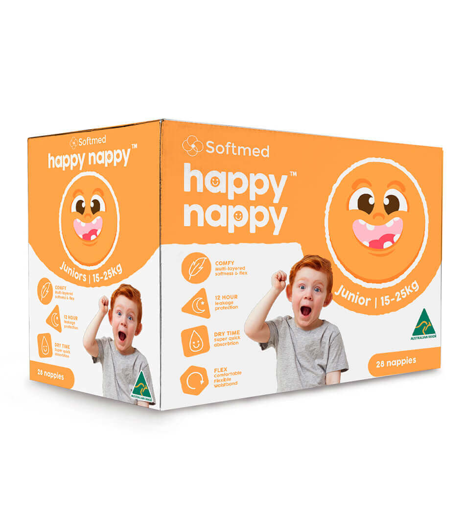
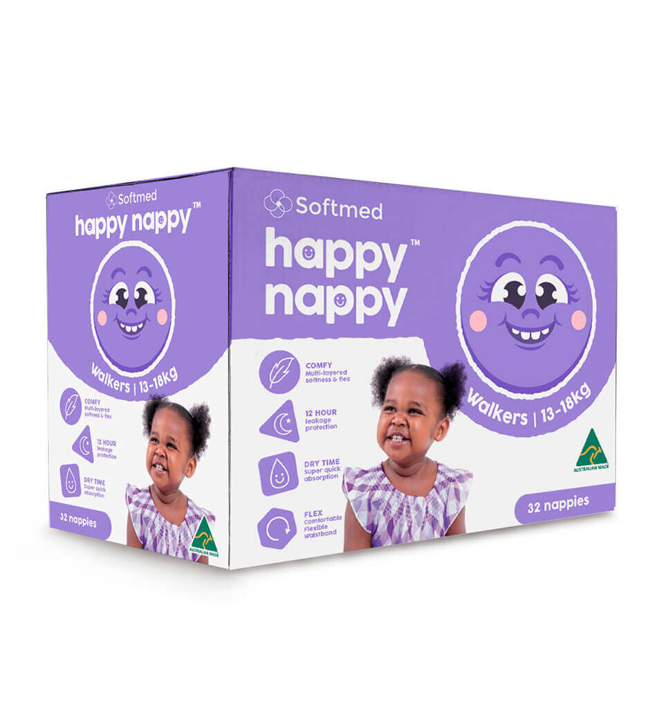
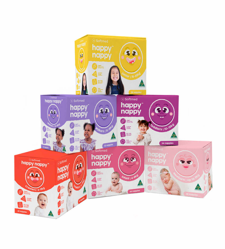
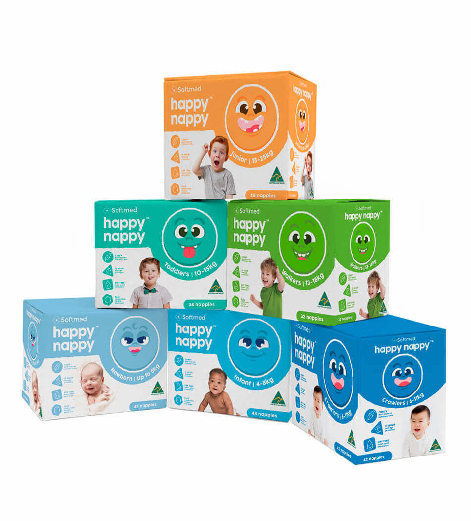
The objective was to develop a new nappy brand identity with a clear, intuitive colour system to distinguish a broad range of gender-specific size options. The design needed to be visually engaging, easily navigable for shoppers, and have strong on-shelf impact.
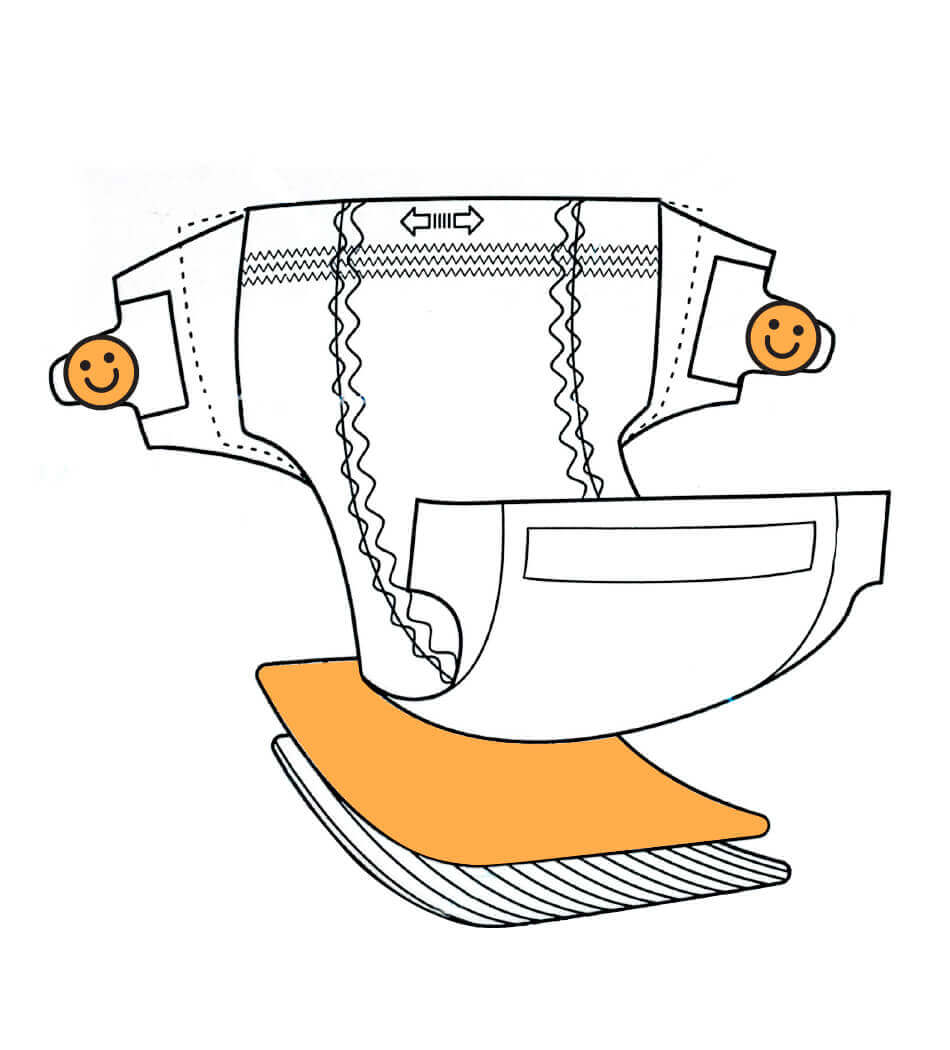
A dual warm-and-cool tone colour system was implemented to denote gender and size distinctions, creating a cohesive yet versatile range architecture. Playful illustrations were integrated not only to enhance visual appeal but also to reinforce the colour coding, helping caregivers quickly identify the right product.
Bold colour palettes combined with expressive illustration styles were key to achieving strong shelf presence and a clearly recognisable brand identity - ensuring the product stands out in a competitive retail environment while remaining accessible and friendly to consumers.