Clarenvale Village
A refreshed identity for a peaceful Chelsea community
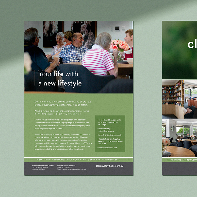
Clarenvale Village is a retirement community set in a quiet, tree-lined Chelsea street. Surrounded by established gardens and just moments from shops, parks and public transport, it offers residents a warm, welcoming lifestyle — close to the things they know and love.
Built 18 years ago, the village had built a strong reputation for comfort and community. But its visual identity hadn’t kept up. The brand felt dated, disconnected from its environment, and didn’t reflect the modern experience residents could expect.
We were asked to reposition Clarenvale Village as a vibrant, friendly and nature-connected community — one that felt as peaceful and inviting as the village itself.
Realigned with lifestyle and location
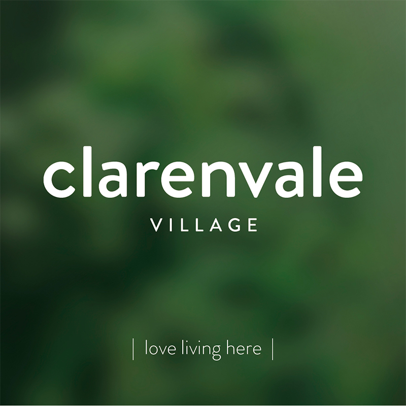
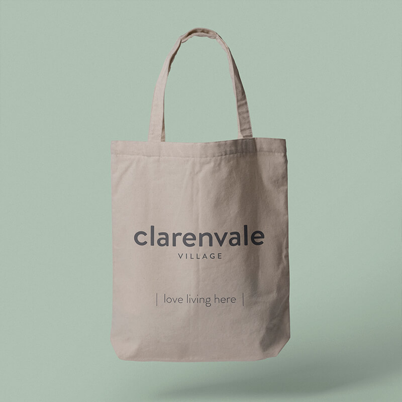
The new brand identity is simple, soft and welcoming. The logo design freed the typography from its original oval enclosure and introduced a modern, rounded sans serif — chosen to reflect warmth and approachability.
The colour palette pairs gentle greens and neutral greys with a soft pop of pink. It’s a scheme that nods to the surrounding gardens and interiors while helping the brand appeal to a new generation of prospective residents.
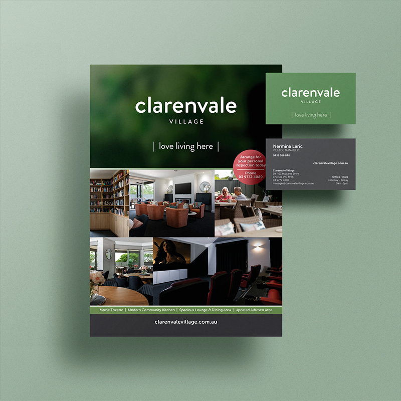
A brand that lives across every touchpoint
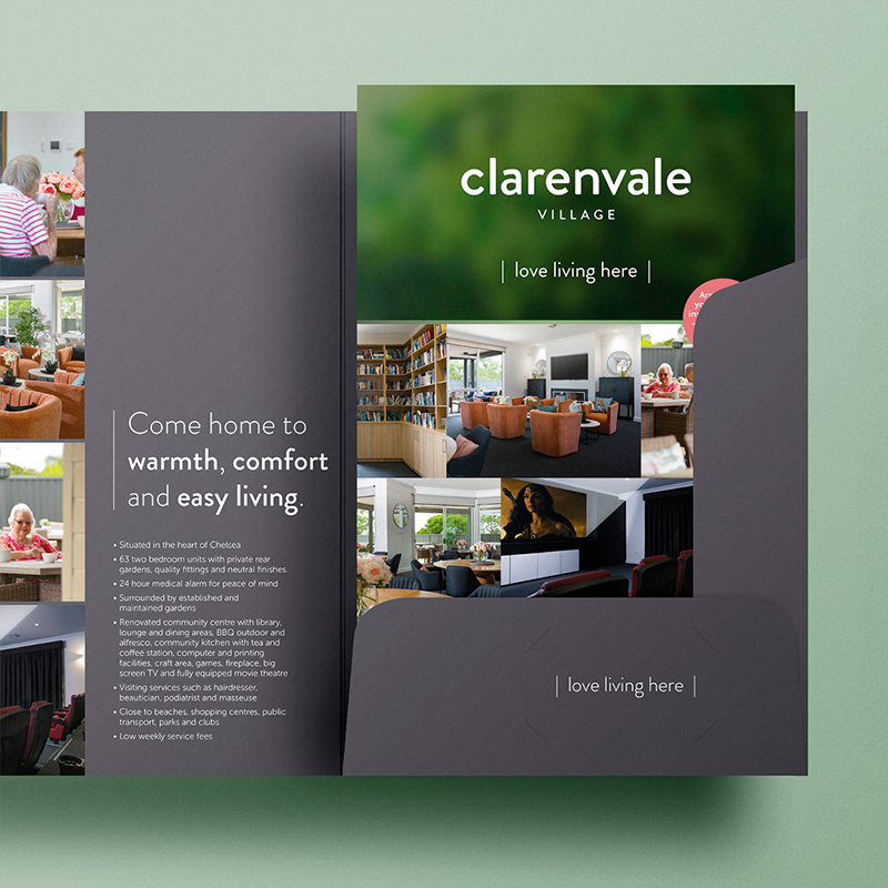
The refreshed identity was rolled out across both digital and print channels, including a new website, updated brochures, open day flyers, presentation folders and reusable tote bags for community events. These touchpoints worked together to bring cohesion and clarity to the Clarenvale Village experience — helping the brand connect with its audience while remaining true to its community-focused roots.